Intro to Data
Visualization
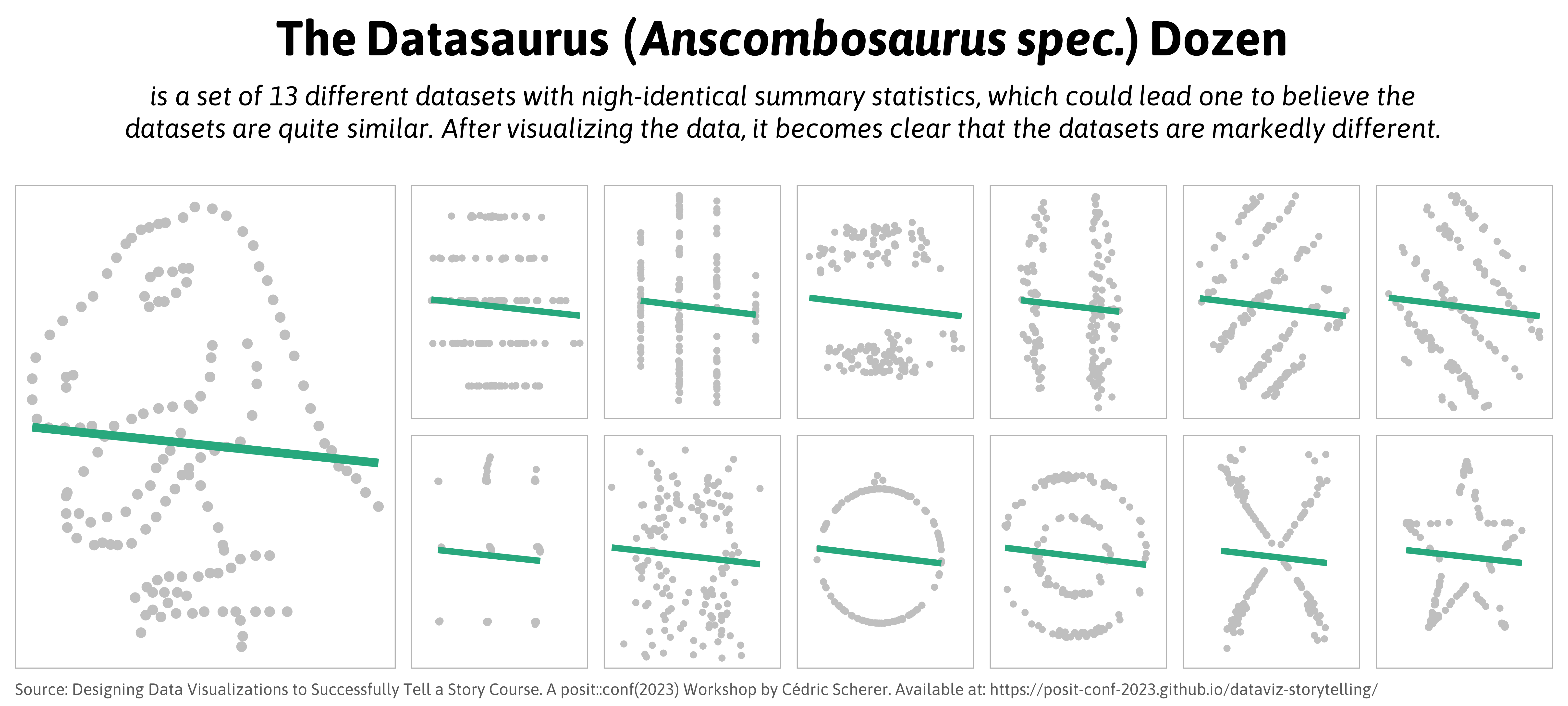
Calculations do NOT replace graphs

Calculations do NOT replace graphs
Fundamentals of data viz
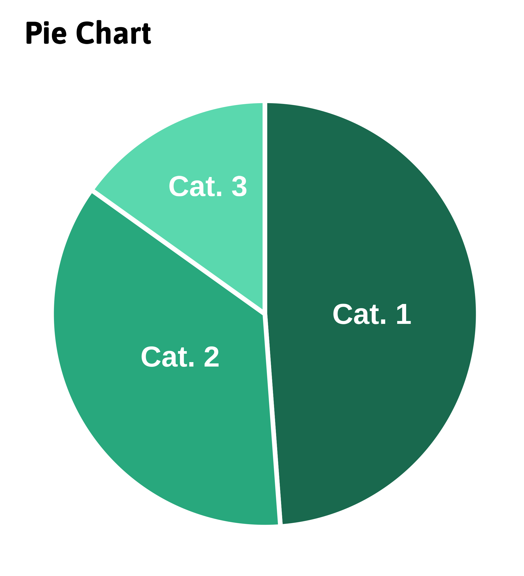
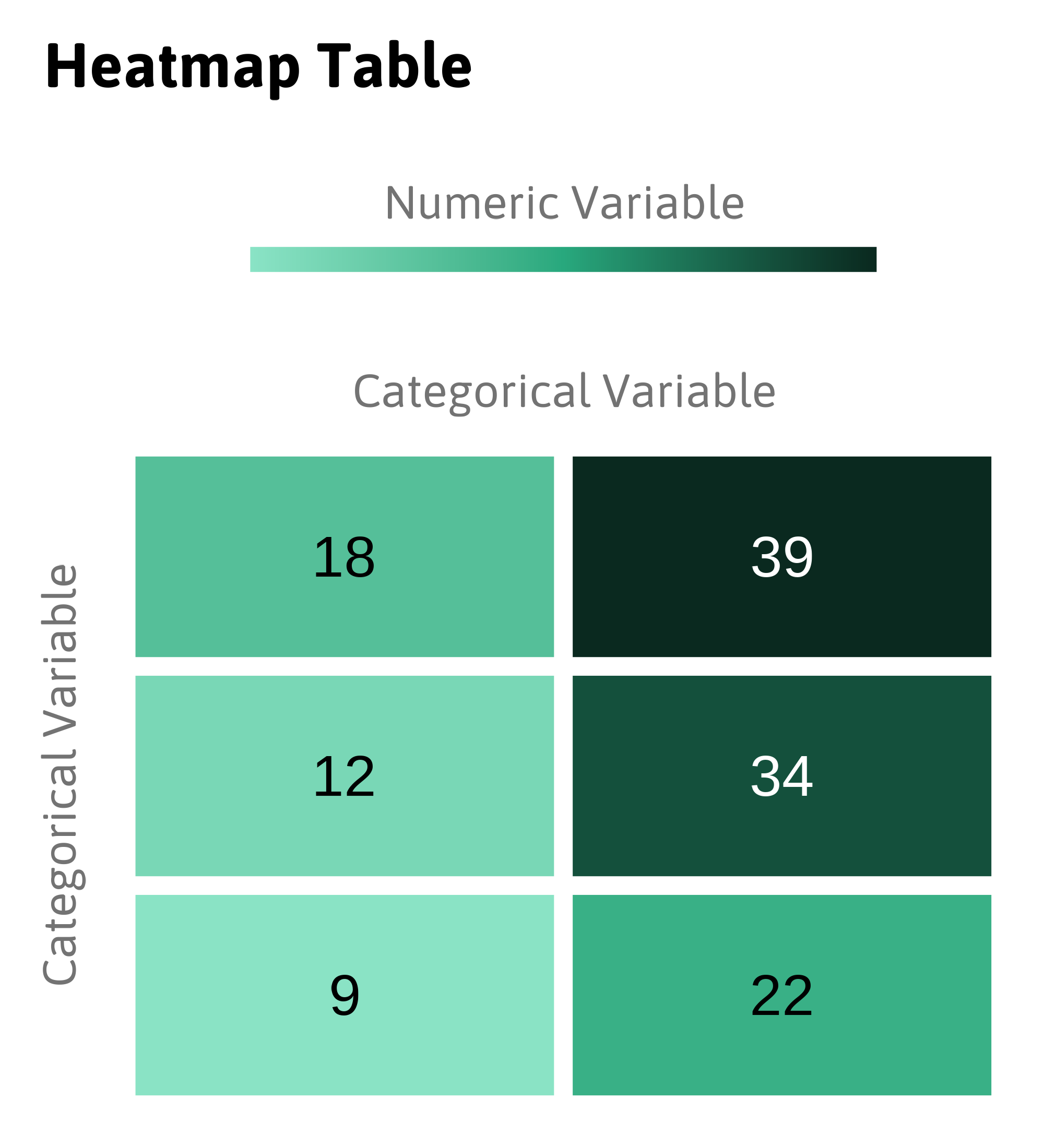
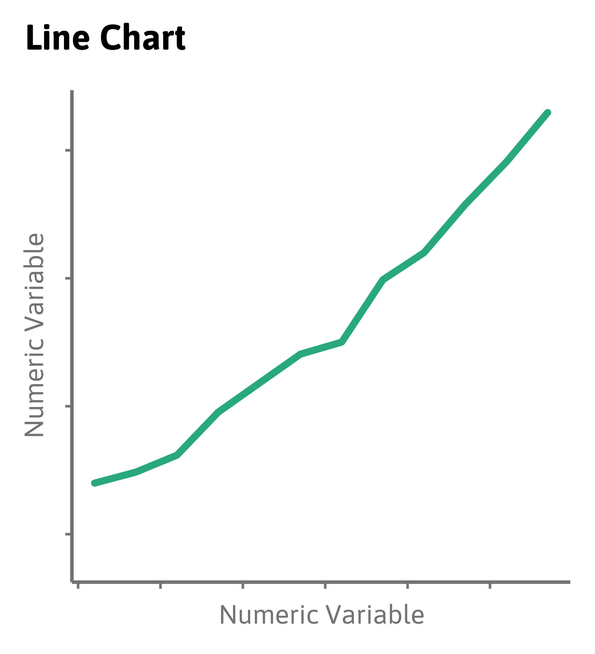
What do a heatmap, a pie chart and a line chart have in common?
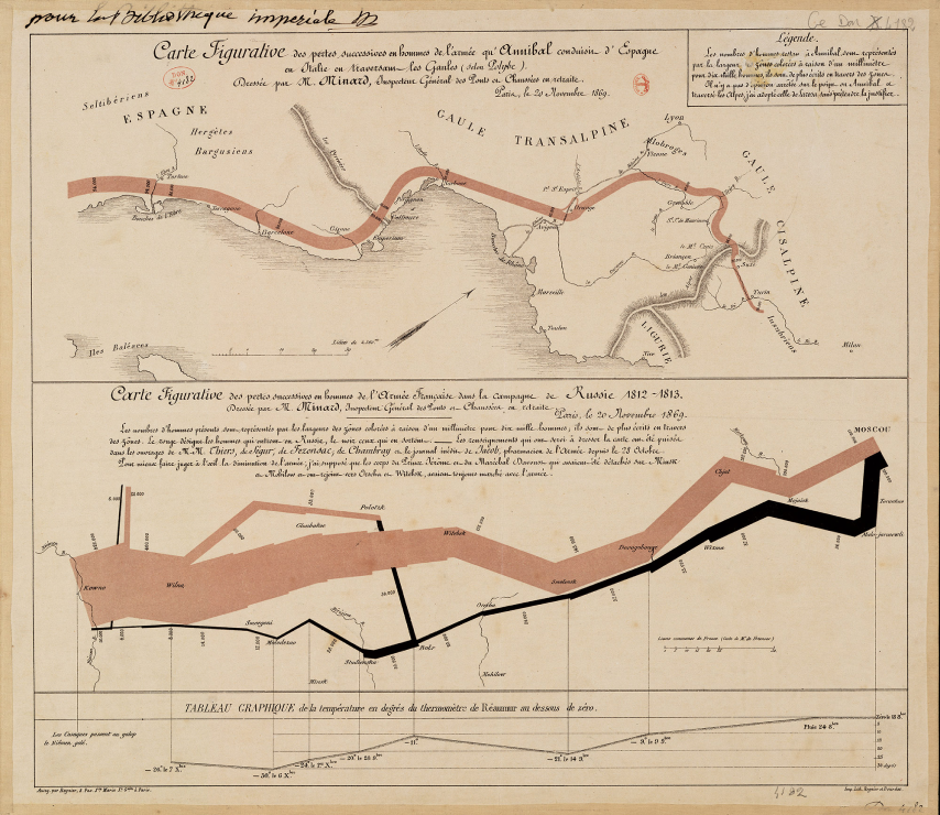
Mapped Dimensions
- Nº of Napoleon’s troops
- distance
- temperature
- latitude
- longitude
- direction of travel
- location relative to specific dates
Common aesthetics

Common aesthetics in data visualization
Intro to {ggplot2}
- Has an underlying grammar
- Easy to combine multiple datasets in the same plot
- Solutions become more intuitive as we get to know the grammar
- Made to work iteratively: start with a raw data layer and add annotations and statistical summaries as you go
- Default graphics are quite good (publication-ready)
First worked example
#Plot
ggplot(data = gm_latest) #Data
First worked example
#Plot
ggplot(data = gm_latest) + #Data
  aes(x = GDPpc) #Mapping
First worked example
#Plot
ggplot(data = gm_latest) + #Data
  aes(x = GDPpc, y = LE) #Mapping
First worked example
#Plot
ggplot(data = gm_latest) + #Data
  aes(x = GDPpc, y = LE) + #Mapping
  geom_point() #Layer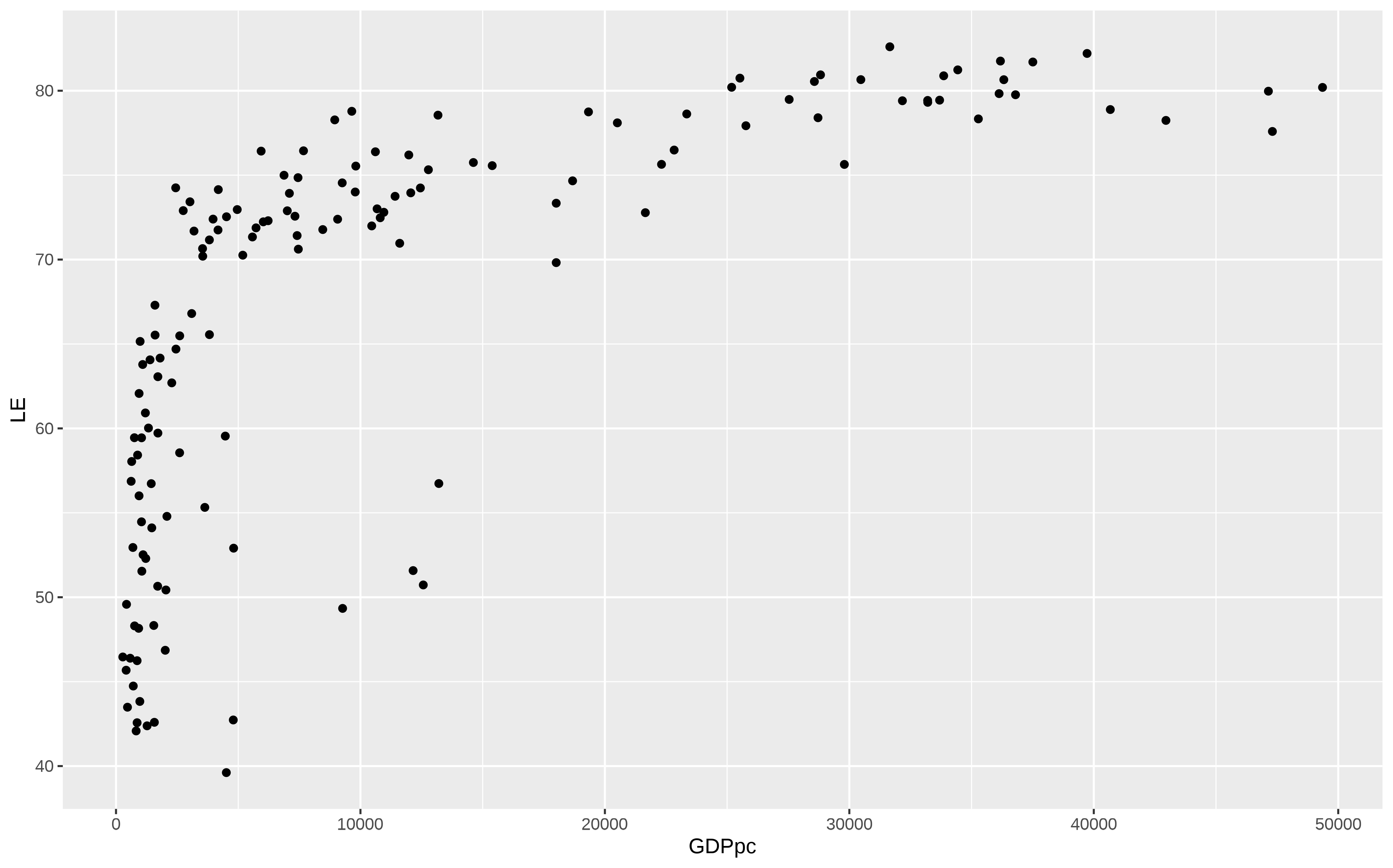
First worked example
#Plot
ggplot(data = gm_latest) + #Data
  aes(x = GDPpc, y = LE) + #Mapping (global)
  geom_point(aes(size = pop)) #Layer with mapping
First worked example
#Plot
ggplot(data = gm_latest) + #Data
  aes(x = GDPpc, y = LE) + #Mapping (global, for all geom)
  geom_point(aes(size = pop, color = pop)) #Layer with mapping (only for this geom)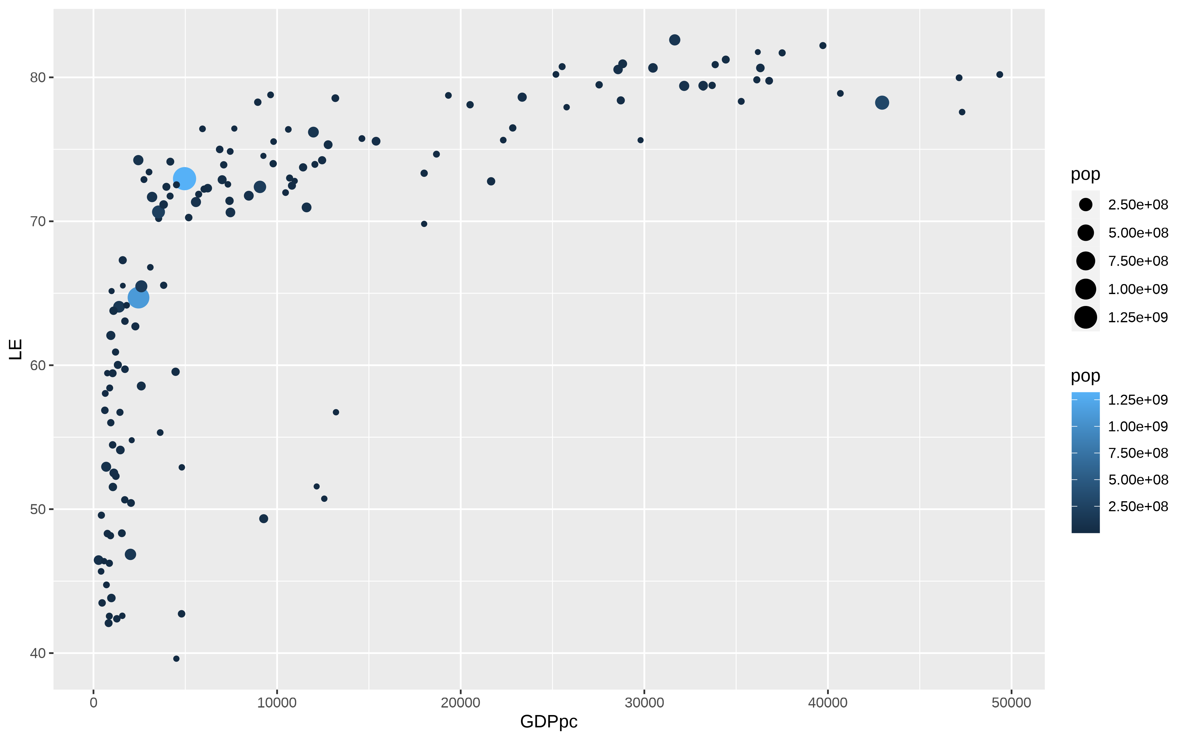
Layer order


{ggplot2} Theme elements
- Taking the
mtcarsdataset as an example
mtcars %>%
  ggplot(aes(x = mpg, y = hp, color = factor(cyl))) +
  geom_point(size = 4) +
  theme(text = element_text(size = 18))
{ggplot2} Theme elements

Static maps with ggplot
#Get the data
world <- map_data("world")

#Plot
world %>%
  ggplot() +
  geom_polygon(aes(x = long, y = lat,
                   group = group))  +
  theme(legend.position = "none") +
  theme_void() +
coord_equal() 